Wed 17 Oct 2018, World Usability Congress, Graz, Austria.
Sales Data as a Table
Month
Salesperson A
Salesperson B
2012-01
28 366
23 274
2012-02
27 050
21 732
2012-03
29 463
23 845
2012-04
32 561
28 732
2012-05
28 050
24 023
2012-06
30 100
26 089
2012-07
22 343
19 026
2012-08
21 506
17 903
2012-09
24 664
19 387
2012-10
28 842
23 490
2012-11
30 621
25 873
2012-12
36 254
28 490
Sales Data as a Line Chart
Information Visualisation
“Let my dataset change your mindset.”
[Hans Rosling, title of talk at TED@State, 03 Jun 2009]
Information visualisation (InfoVis) is the visual presentation of
abstract information spaces and structures, together with accompanying
interactions, so as to facilitate their rapid assimilation and
understanding.
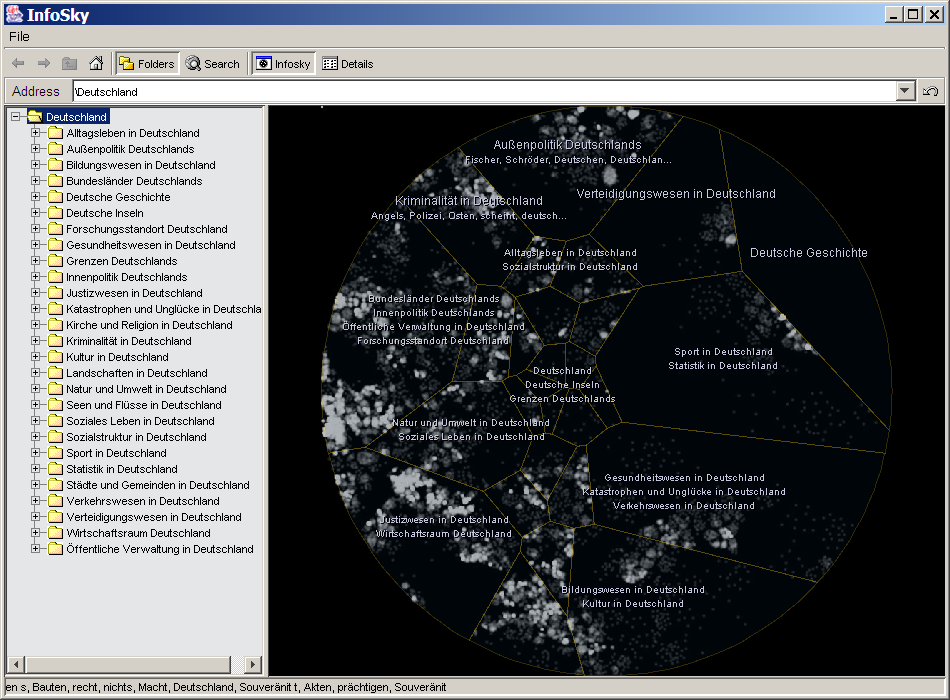
Visualisation
The broader field of visualisation has three main sub-fields:
InfoVis:
Information Visualisation (InfoVis) deals with abstract information
structures, such as hierarchies, networks, or multidimensional spaces.
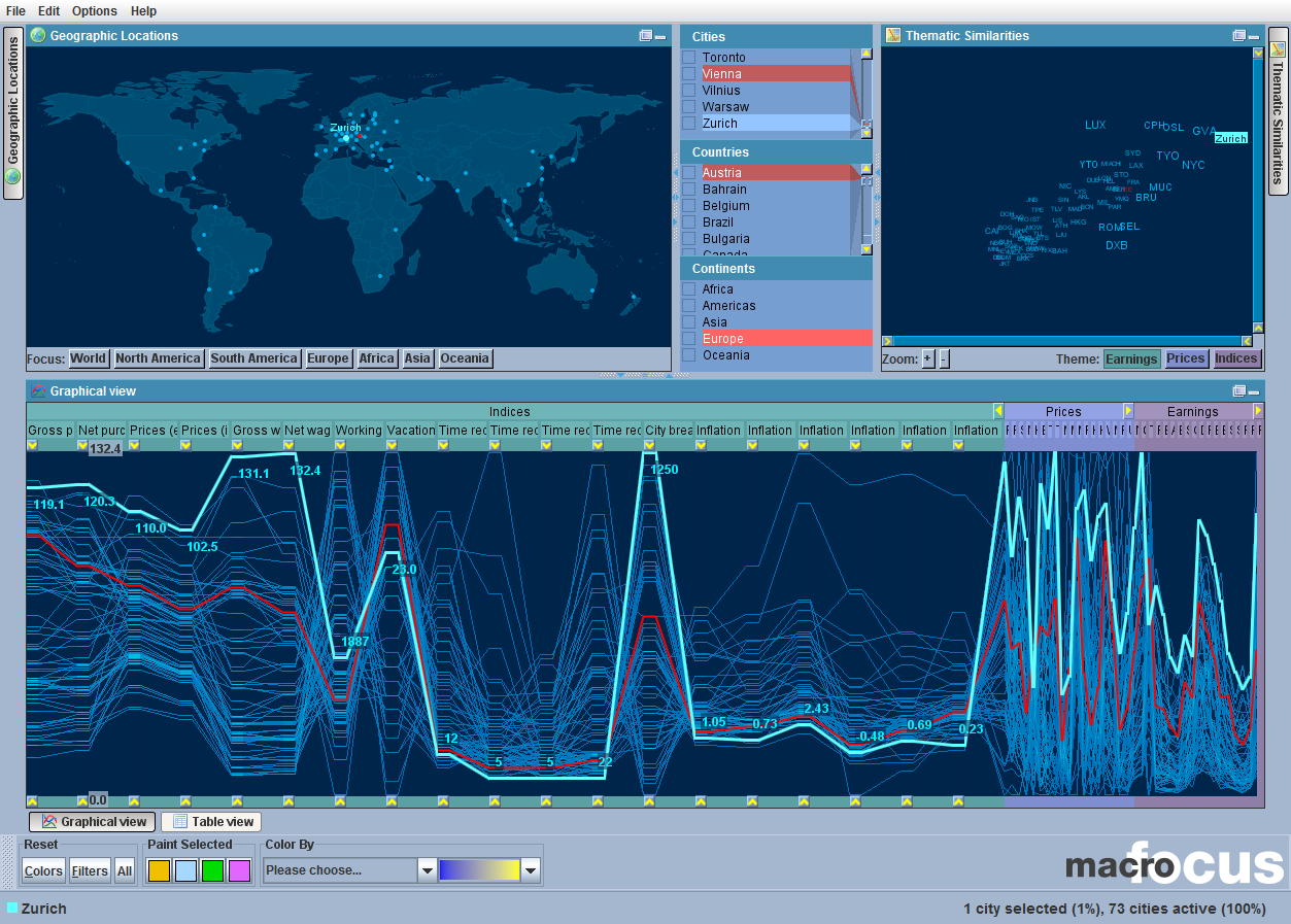
GeoVis:
Geographic Visualisation (GeoVis) is map-based. The data typically has
inherent 2d or 3d spatial coordinates, and is generally shown in
relation to a map.
SciVis:
Scientific Visualisation (SciVis) typically involves concrete (3d)
objects, for example a medical scan of part of the body, or a
simulation of air flow around an aircraft wing. SciVis visualisations
often depict flows, volumes, and surfaces in (3d) space.
In SciVis, the visual representation (geometry) is generally given,
suggested by objects in the data.
[concrete objects, geometry is given]
In GeoVis, the visual representation (geometry) is generally given,
determined by spatial coordinates within the data.
[spatial coordinates, geometry is given]
In InfoVis, an appropriate visual representation must be (carefully)
designed or “invented”.
[abstract structures, geometry is chosen]
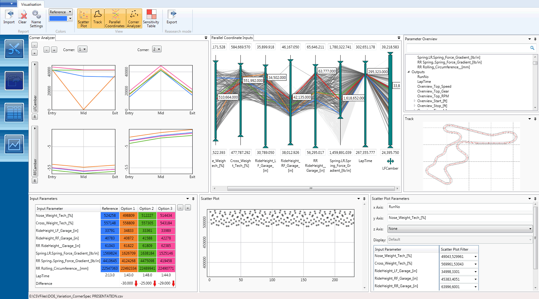
Interactive Information Visualisation
Visual Representation + Interaction.
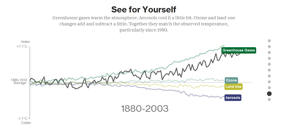
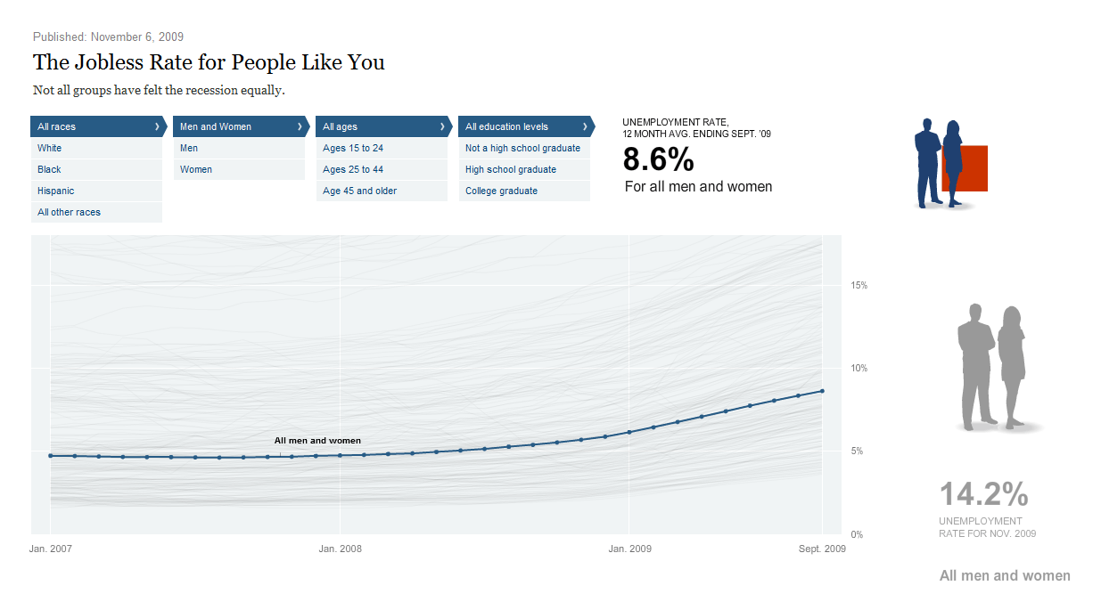
Two main use cases:
Explore (Analyse): help researchers explore and analyse.
Explain (Present): present results and insights to a wider public.